Category Archives: Visual Aesthetics

Visual Aesthetics Infographic

http://student.elon.edu/nelingburg/infographic_current.swf

Both time periods look bad, but this recession doesn’t compare to the Great Depression. The charts looks similar due to scaling.

Our third project for Phillip’s Visual Aesthetics class might have been my least favorite.  Working on Flash projects in groups just doesn’t seem to work as well as the individual projects.  On the positive side it gives you a chance to learn from other group members or teach them.  Group projects are tough as it is but they’re especially difficult when only one person can access the file at a time to make changes.

We were given the economy as a topic to make an infographic about.  The group chose to compare the economy of today to how it was during the Great Depression.  My job in this project was to research the stock market during these years and find comparable numbers and charts that we could show in a graph form.  I ended up making a line chart that is not visible at first, but once the reveal button is clicked the line of the line chart begins moving across the chart.  Hotspots appear on the line to indicate important dates and government involvement.  Overall I think we did a good job on the project, but I think it could have been better.  I say this knowing that we made it in the middle of the semester and seeing how everyone’s work has improved since then.

Kelsey did a great job designing the dock while Emily implemented some advanced Flash that took our project to the next level.
Tagged

Journalism in the Age of Data

http://kottke.org/10/09/journalism-in-the-age-of-data

“Journalism in the Age of Data” has made me realize two things: the people who work in the info-graphics business are a little strange, and my group project on the economy needs to be tightened so that it tells more of a story.  Luckily, I can do something about my second realization.  During our critiques in class on Friday, Lou made the most important and useful observation about our project: it was missing a page that tied the whole story together.  His idea was to do a final graphic on the government involvement during the Great Depression and the current recession.  The two obvious examples being FDR’s New Deal and 2008’s $787 billion stimulus package.

The New York Times goes above and beyond with their data visualizations.  I was most impressed with the porcupine line graph of current economic data, which then had the experts’ projected data that was always higher and more optimistic than what actually ended up happening.  I wonder if Amanda Cox, the “queen” of info-graphics, only works on info-graphics or does she do other stuff as well for the New York Times.  I think I would be incredibly bored only creating info-graphics as my job and thinking up new ways to tell the story of the information.  I would have to be doing something else as well like we do in iMedia, flash projects mixed in with info-graphics and videos.  I think it takes a certain person like you see in the video to be able to only do info-graphics for a living.

An entire year of someones life chronicled through infographics.

The section of the video “Life as a Data Stream” is the coolest part of the video.  Nicholas Felton’s idea to go back and look at the past year of his life and turn that information into a book of info-graphics is a great and innovative idea.  Someone in iMedia could do their capstone project on information like this and print it out into a little book like he did.  I think this would be a very successful project because the concept is familiar but it has its own twist that makes it unique.

Tagged

The Beatles Alarm Clock App

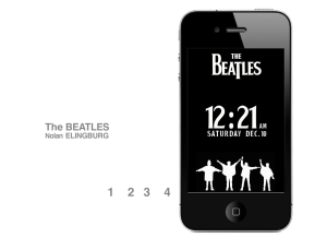
For Visual Aesthetics we had to create an alarm clock app for our final project.  We had the option of designing it in Illustrator, Photoshop or Flash and then had to give it some function in Flash.  I’m pleased with the design and layout of my project, I just wish I had been able to get it to function more in terms of navigability.  I ran into some problems that I couldn’t fix and had to do very basic navigation.

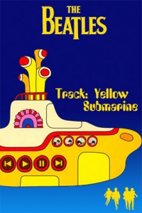
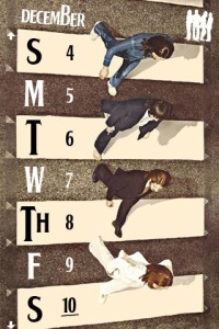
I wanted to use each silhouette to direct to a different feature.  The first one would take you to the alarm clock, second to the calendar, third to the radio and fourth to an iTunes image.  I was able to make that navigation work, but I had to make the buttons little rectangles that fit inside the silhouettes.  When it would go to the desired page the buttons would still be showing, so I made them numbers and put them outside of the iPhone.

No band will ever be better than The Beatles.

I needed to figure out a true/false statement that would make them visible on the home screen and invisible once they went to a new page.  Then when navigated back to the home page they would be visible again.  I also created buttons on each feature that would take you back to the home screen.  I went with the theme throughout to use the silhouetted images of The Beatles as the home button.  I couldn’t get these to work either because it kept saying it couldn’t recognize the movie clip that they were in.  I checked to make sure that everything was named properly and it was, but it still wouldn’t work.

Here is the code I had to use for the home screen navigation:

stop(); alarm_btn.addEventListener(MouseEvent.MOUSE_UP,buttonPressed1); function buttonPressed1(event:MouseEvent){ home_mc.gotoAndStop(2); }

calendar_btn.addEventListener(MouseEvent.MOUSE_UP,buttonPressed2); function buttonPressed2(event:MouseEvent){ home_mc.gotoAndStop(3); }

radio_btn.addEventListener(MouseEvent.MOUSE_UP,buttonPressed3); function buttonPressed3(event:MouseEvent){ home_mc.gotoAndStop(4); }

itunes_btn.addEventListener(MouseEvent.MOUSE_UP,buttonPressed4); function buttonPressed4(event:MouseEvent){ home_mc.gotoAndStop(5); }

I wanted to make my radio play Yellow Submarine when you click play. I used the actionscript and xml files that we used for our mp3 player in class. It wouldn't play even though no errors came up.

Tagged